Department of
Strategic
Communication
Strategic
Communication
Cal Poly Pomona
Campaign \ Digital Design
The Cal Poly Pomona Department of Strategic Communication (Strat Com) is responsible for driving clear, consistent and coordinated brand storytelling. They have a portfolio of projects including media relations, reputation management, crisis communications, branding, marketing, digital and social media, executive and internal communications, and graphic design and standards. The goal of these projects being to inspire and educate the Cal Poly Pomona community.
While working with StratCom, I led creative ideation and production for marketing campaigns to cut-through media clutter and captivate audiences for print, digital, social, and web channels with a reach of over 3 million impressions per month.
Vaccine Clinics
Part of Cal Poly Pomona's Safer Return campaign included offering free Covid-19 pop-up vaccine clinics for students. The pop-up clinics promotion is meant to incentivize and inform students about upcoming vaccine opportunities. With this, graphics were requested to be eye-catching and refreshed every season across four of its iterations run on digital channels (campus website, Twitter, and Instagram)
Graphics had a reach of 2.4 million impressions per month on web while reaching an additional 36,000 people through Instagram.



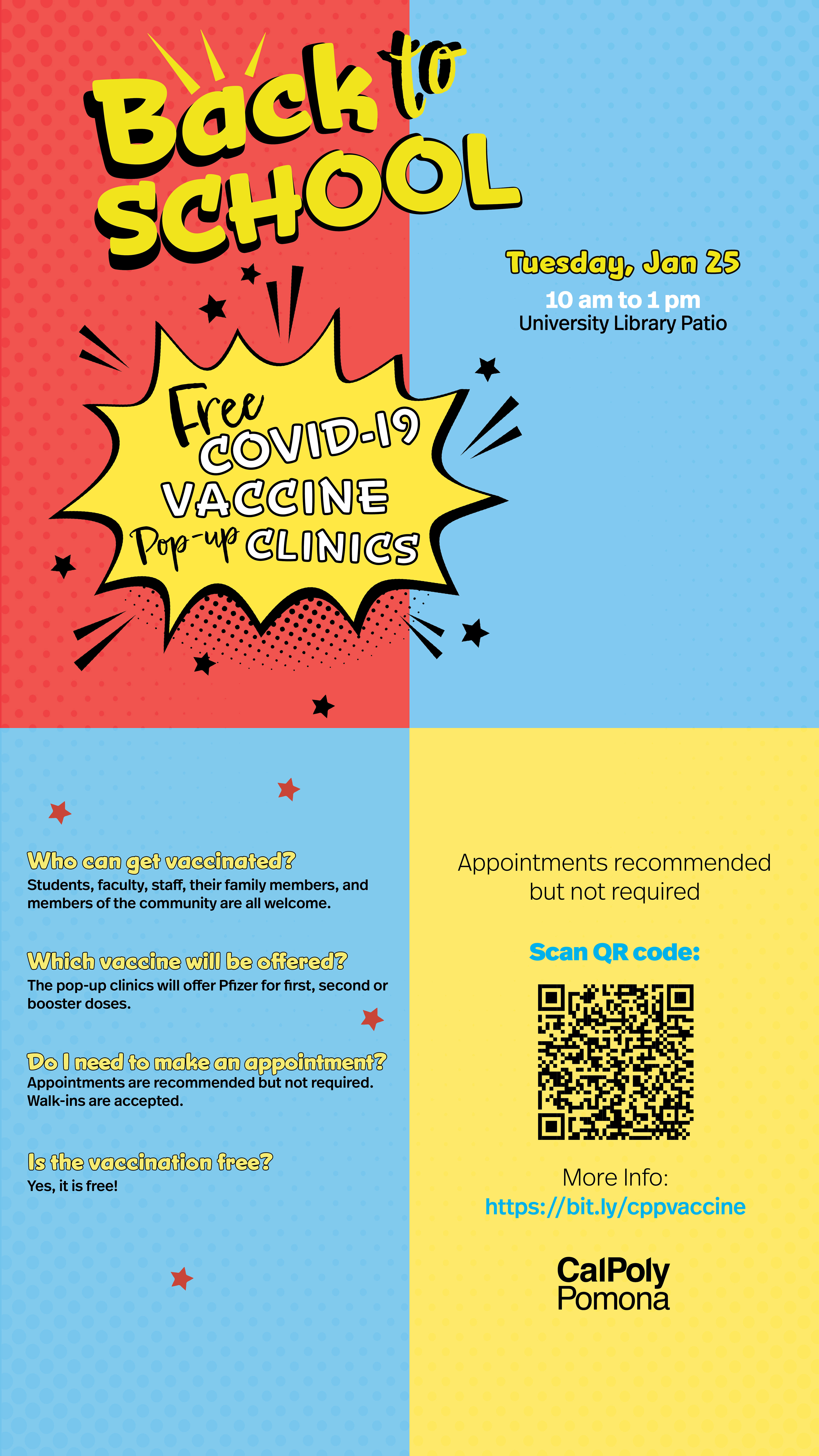
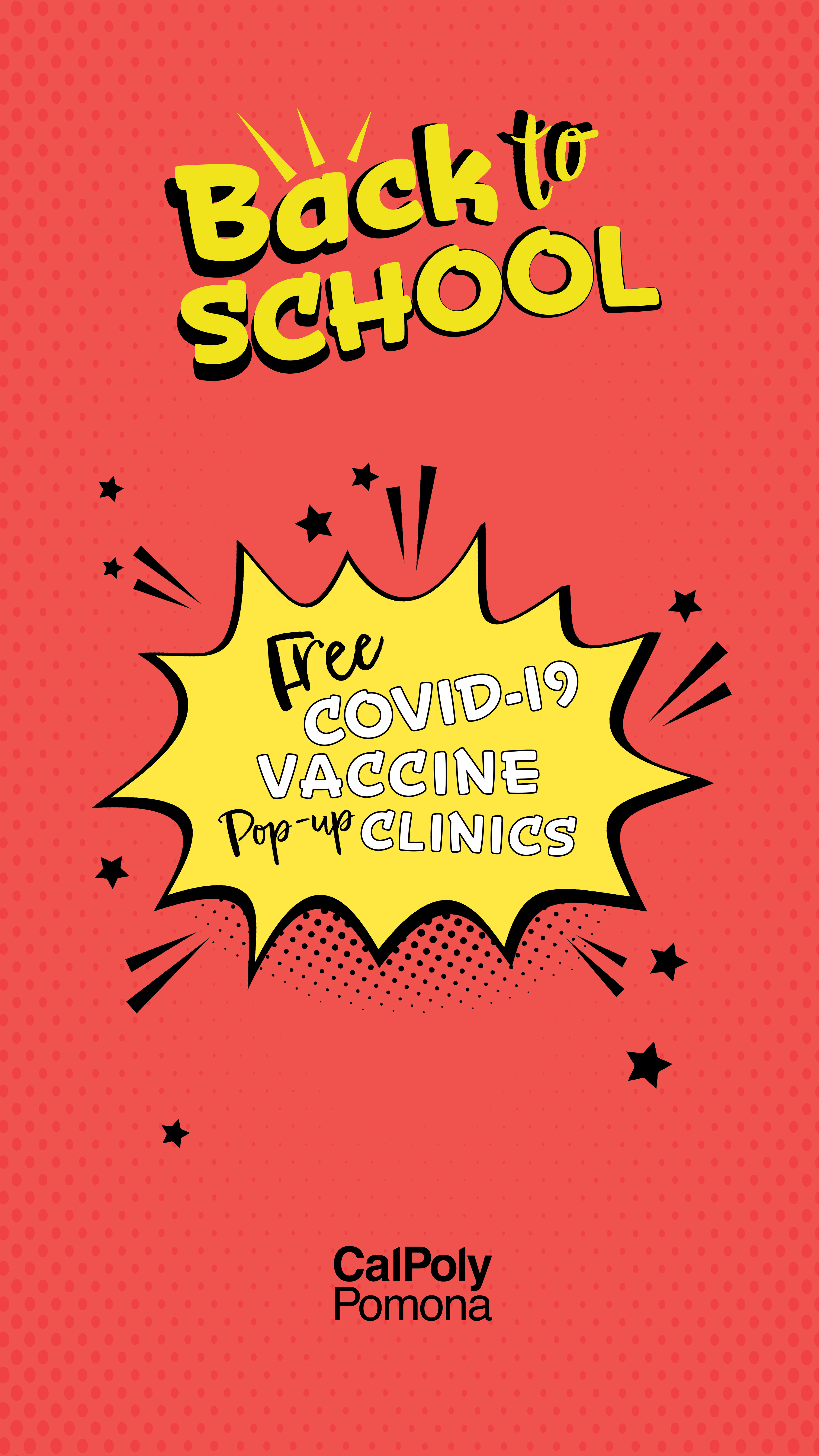
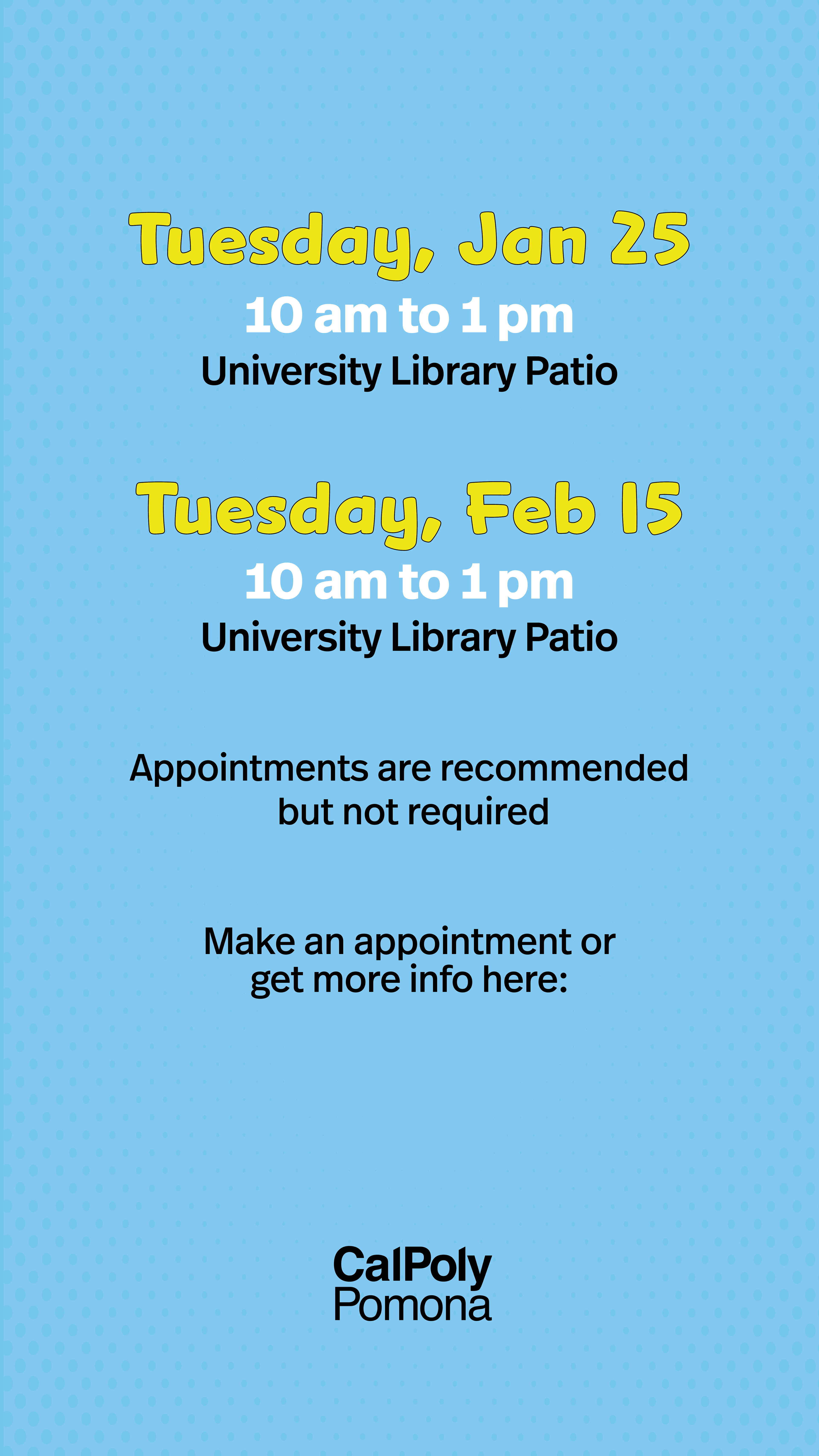
Summer 2022
The request for these graphics was to capture the essence of summer through bright vibrant colors and create something on trend with the design. To capture this, inspiration was taken from the southern California sun to create a reverse color effect on the typography in the design.
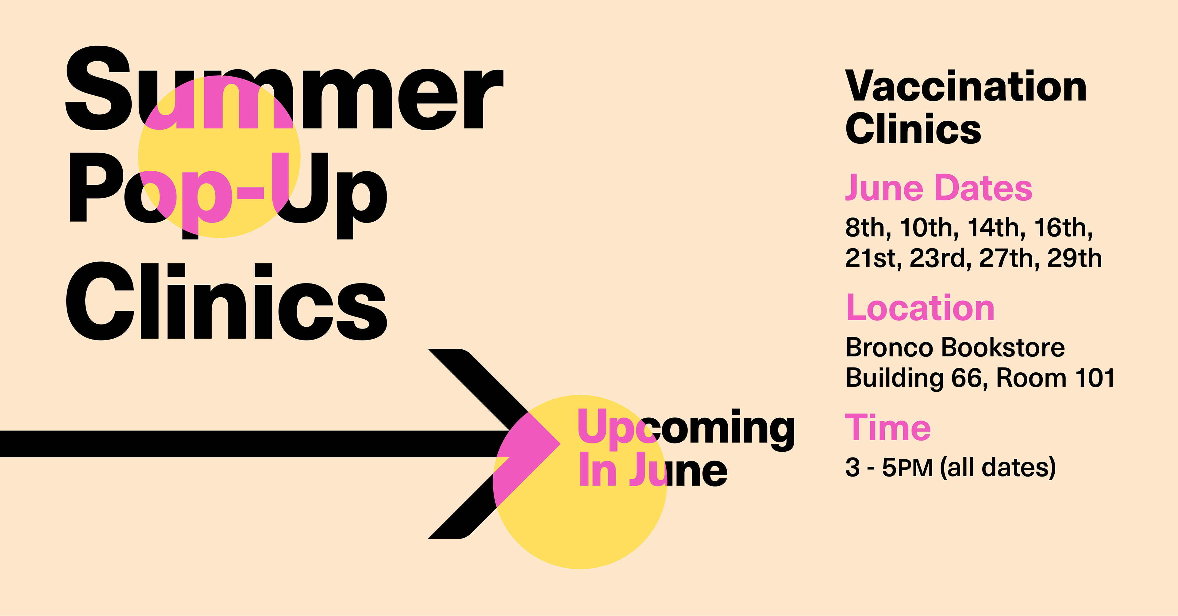

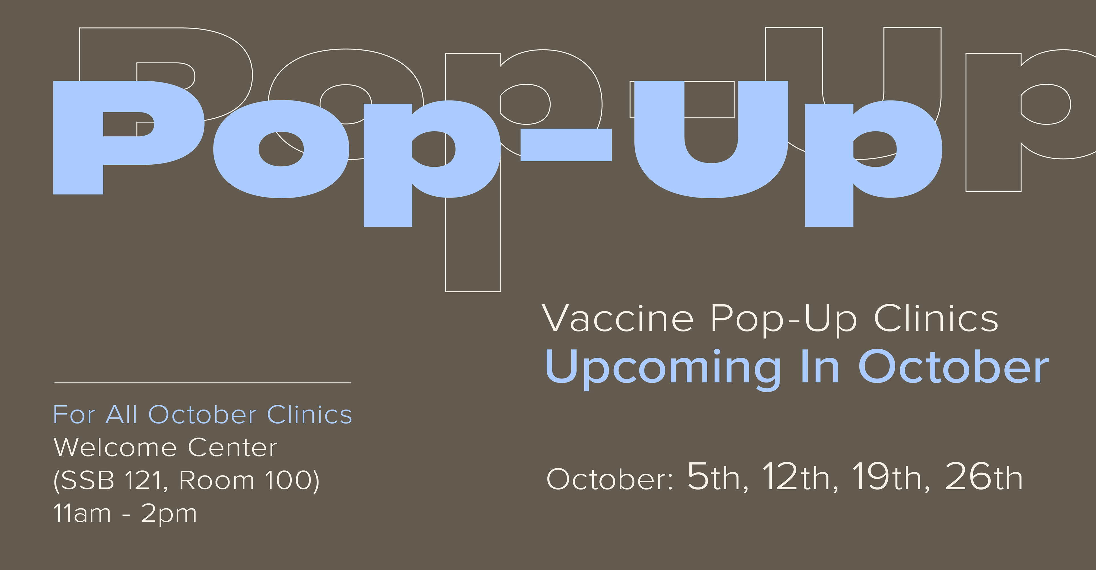

Fall 2022
This iteration of the campaign had a unique request as it was asked to capture the essence of fall. All other iterations wanted something bright and vibrant, which created a unique design challenge. Create something eye-catching and attention grabbing without it feeling summery. The solution was in playing with scale and looking at the color wheel to find enough contrast in colors while maintaining a fall essence.
How to Get to Cal Poly Pomona
A challenge in energizing the masses and sparking action.
How to Get to Cal Poly Pomona was created to inspire students to return to in-person classes. In the wake of Covid, online classes, fear of infection, and lack of transportation were driving students to remain home. This campaign was meant to ease the latter of the issues through promotion of the Foothill Transit 'Class Pass'.
The Class Pass gave students access to free public transportation. Being a largely commuter school with minimal parking, public transportation was a necessity for many students. The challenge, how to make a generalized transportation fit into the Cal Poly Pomona branding system.
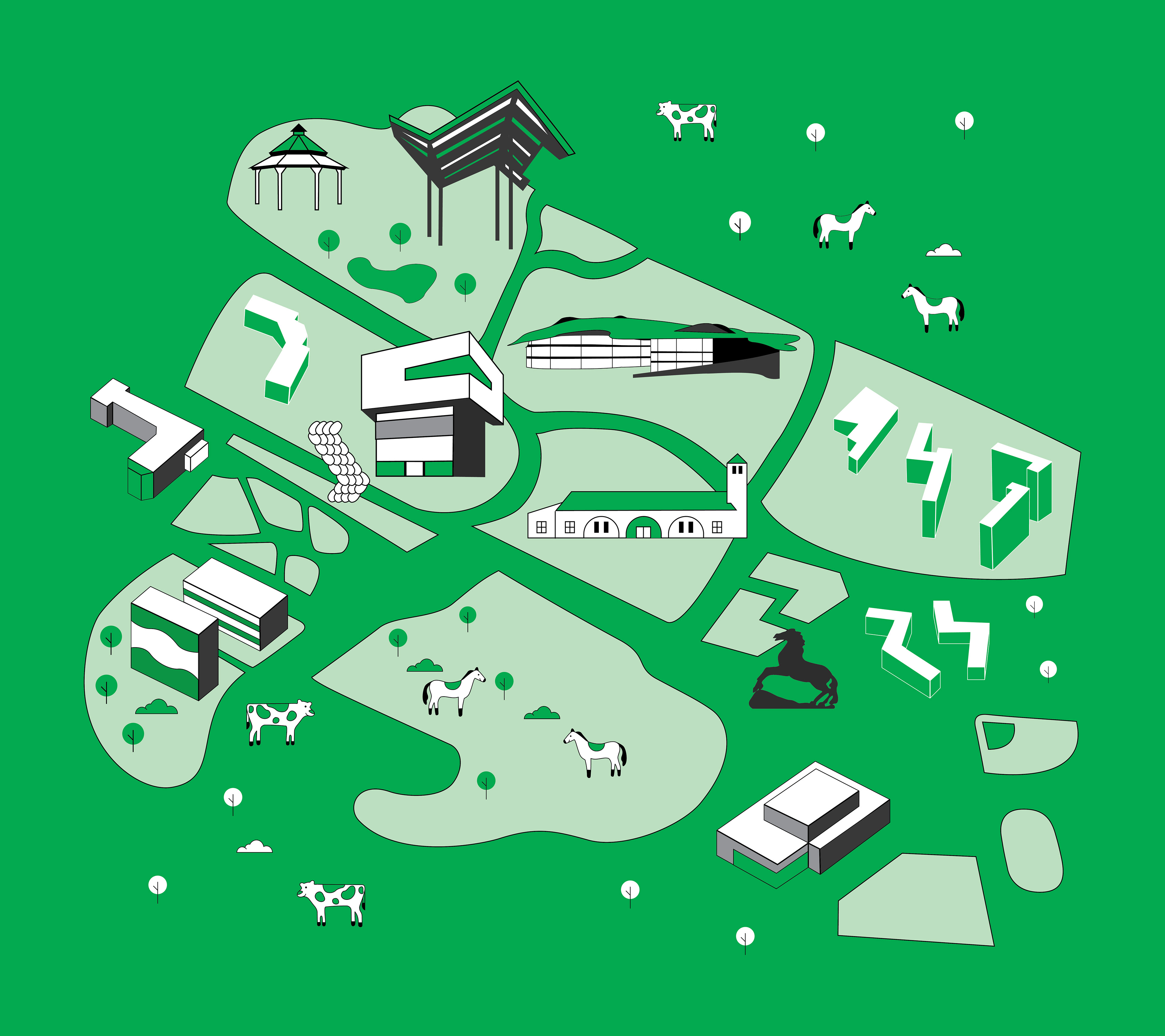
One of the key ways this connection was made early on was the usage of a monochromatic design featuring Cal Poly Pomona's green. This was a simple and forward way to subliminally key in viewers that this directly relating to Cal Poly Pomona. Something that was established later on was a robust iconographic representation of key architecture at Cal Poly Pomona.
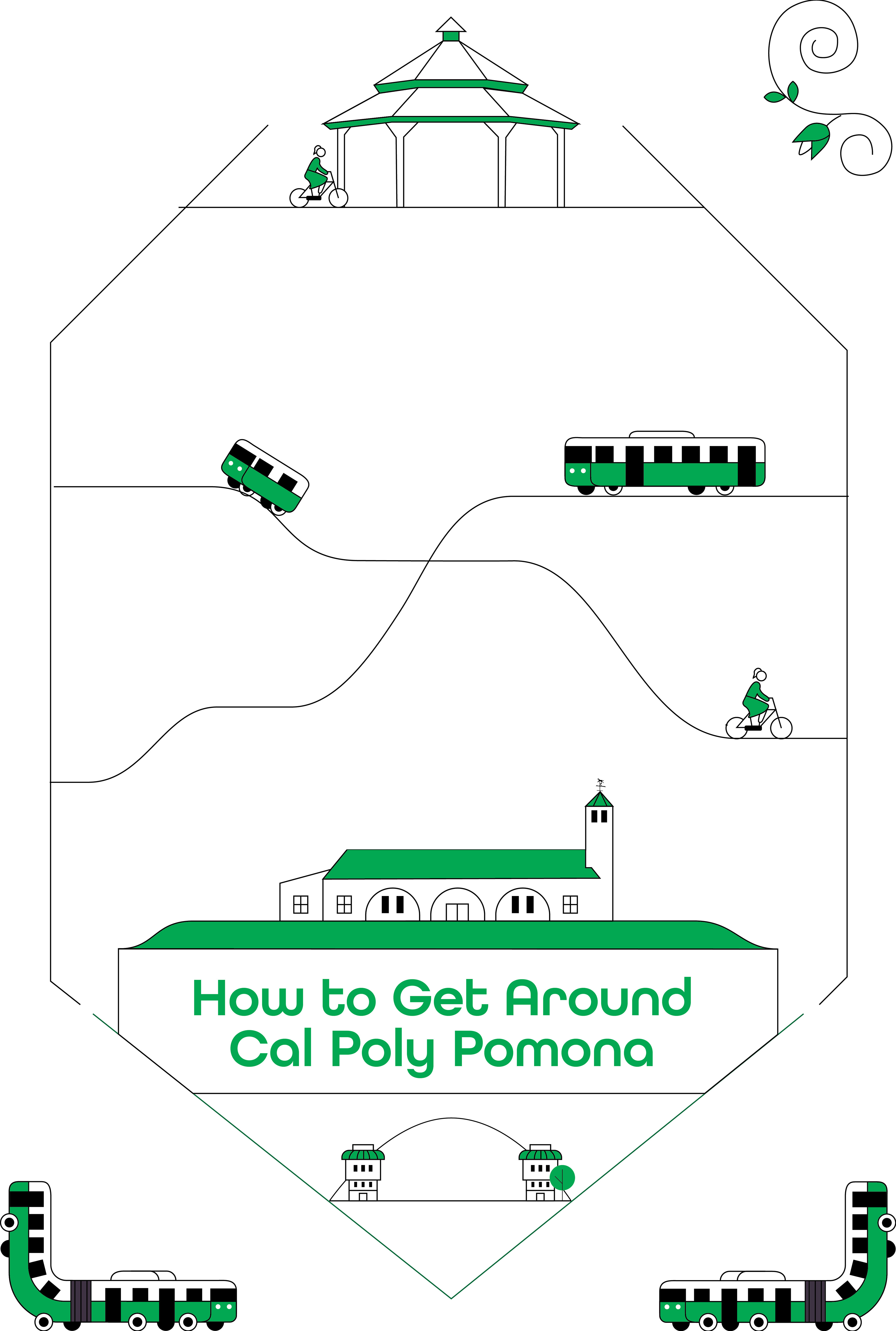
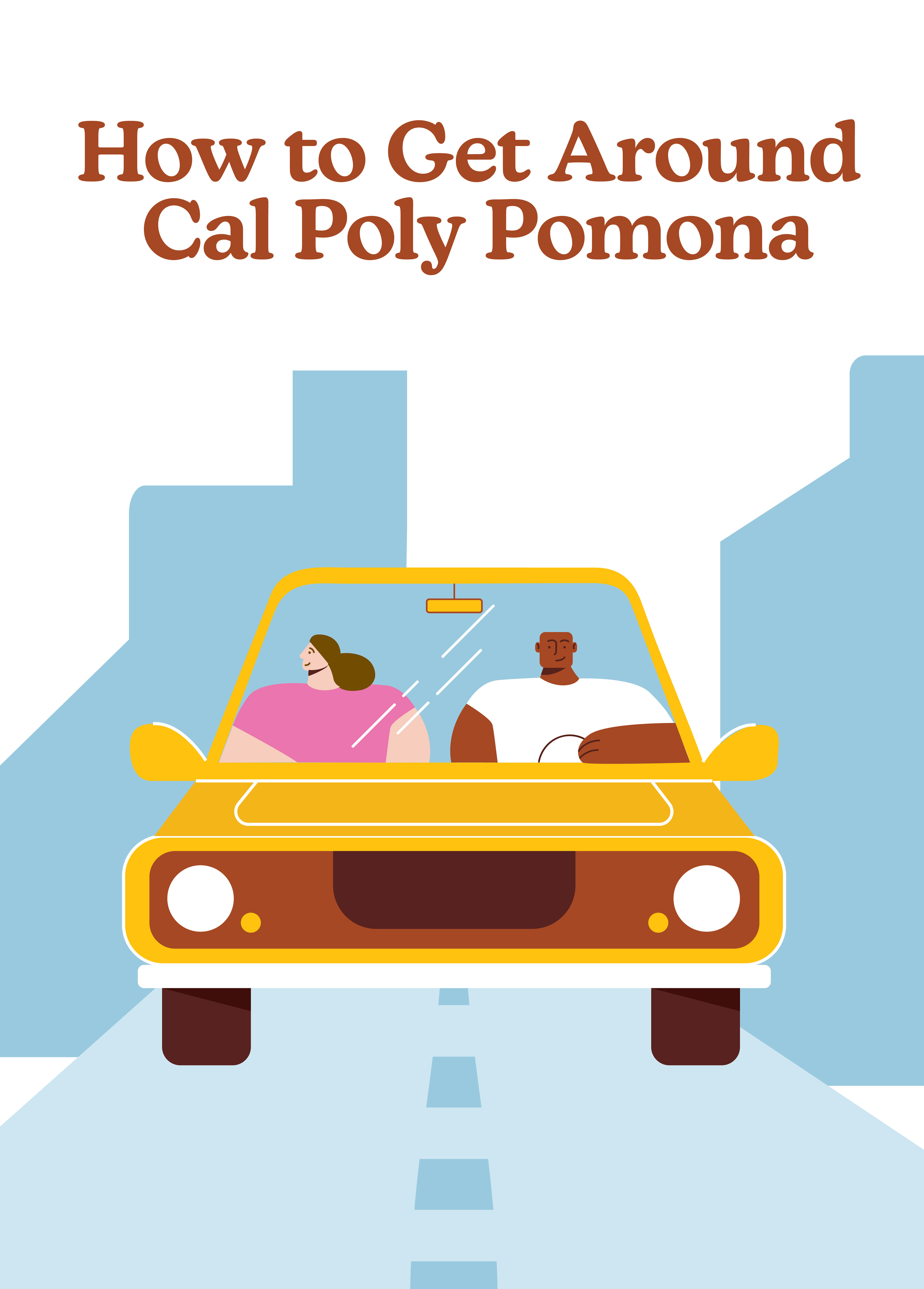
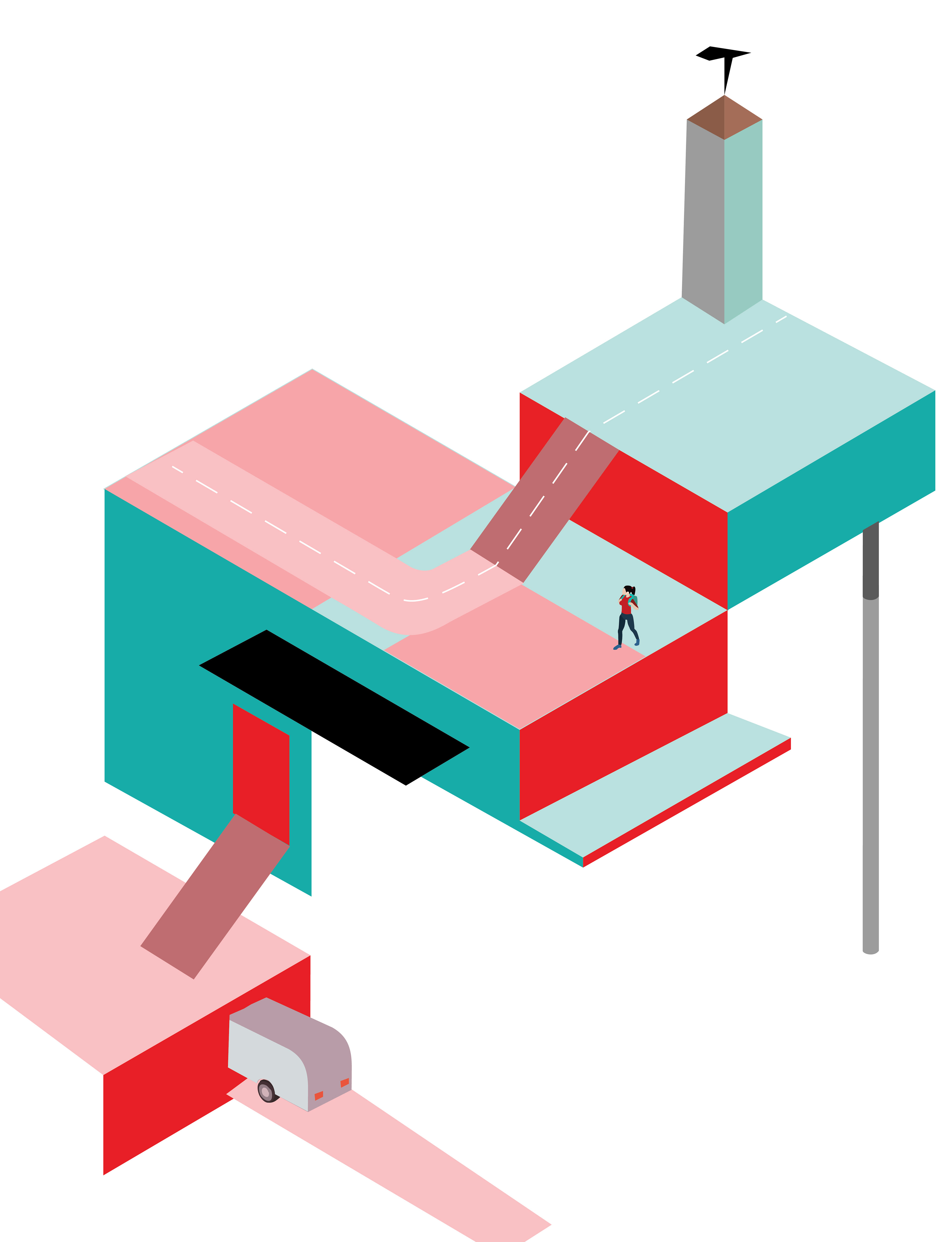
Initial design concepts went in three completely unique directions to explore what style would best fit the needs of the campaign.
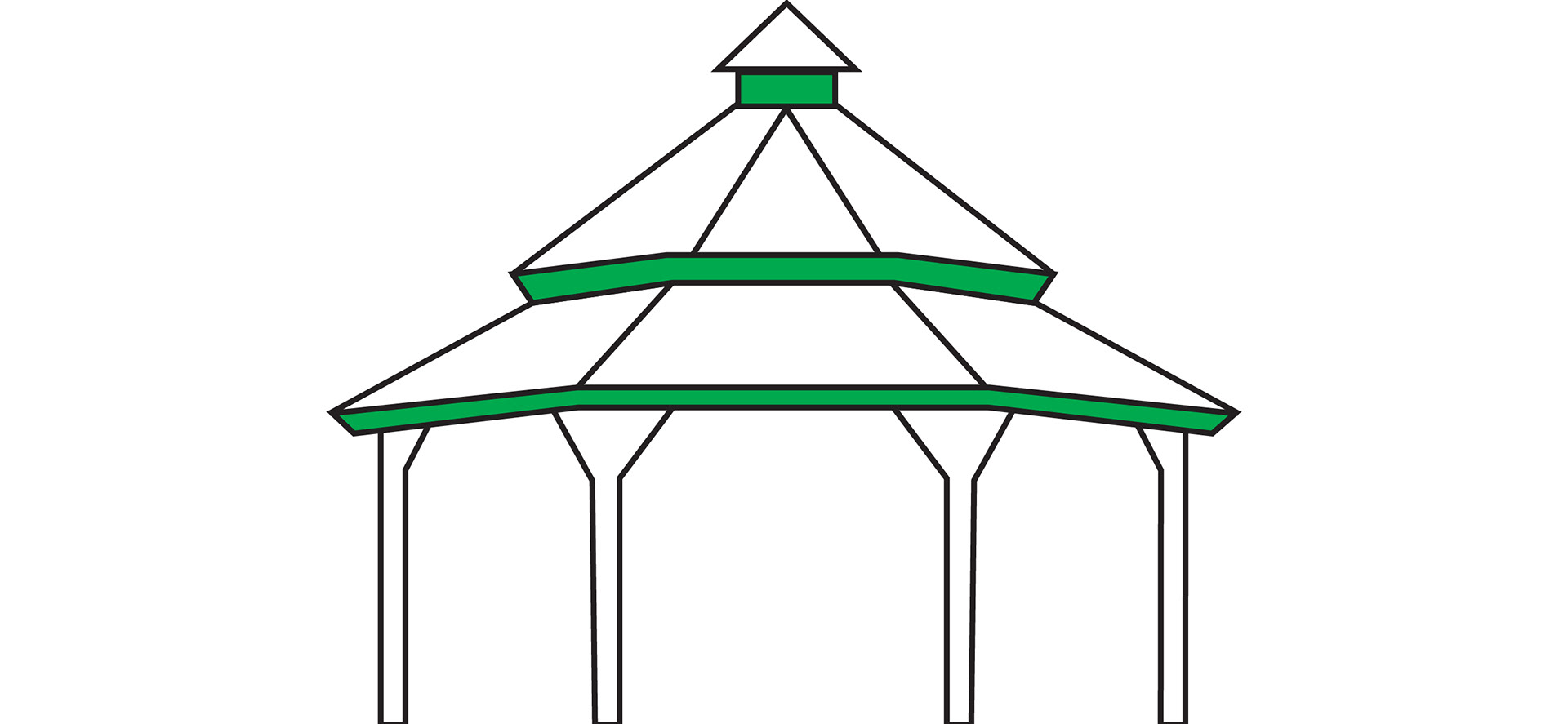
Campus Architecture
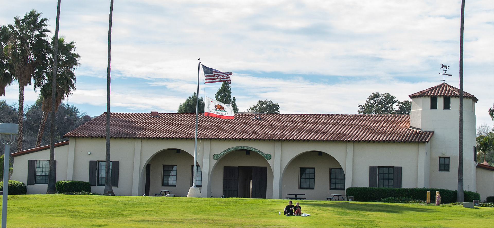
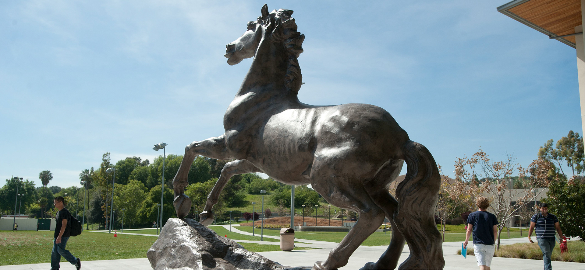
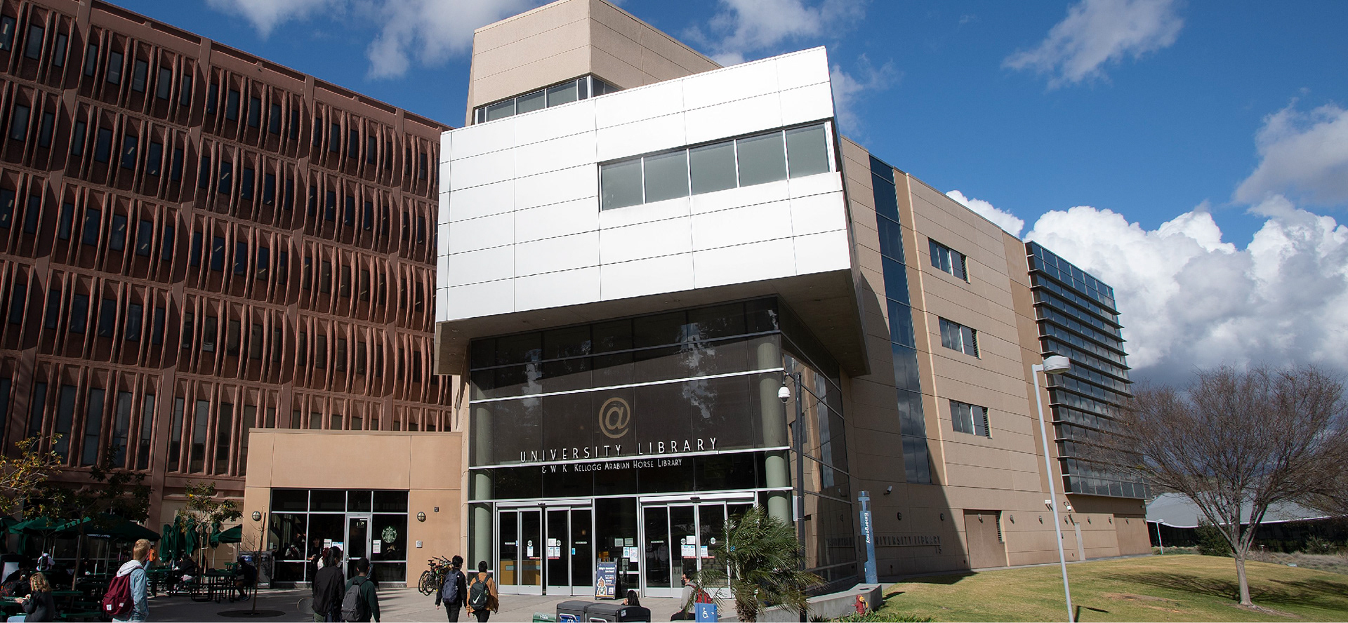
Seen below are the four major pieces of campus architecture recreated in the promotional graphics. Highlighted are old horse stables, an Arabian horse stature, the university library, and a historic gazebo in the university rose garden. These were chosen for their immediate recognizability by the campus community and unique silhouette.




Tablecloth
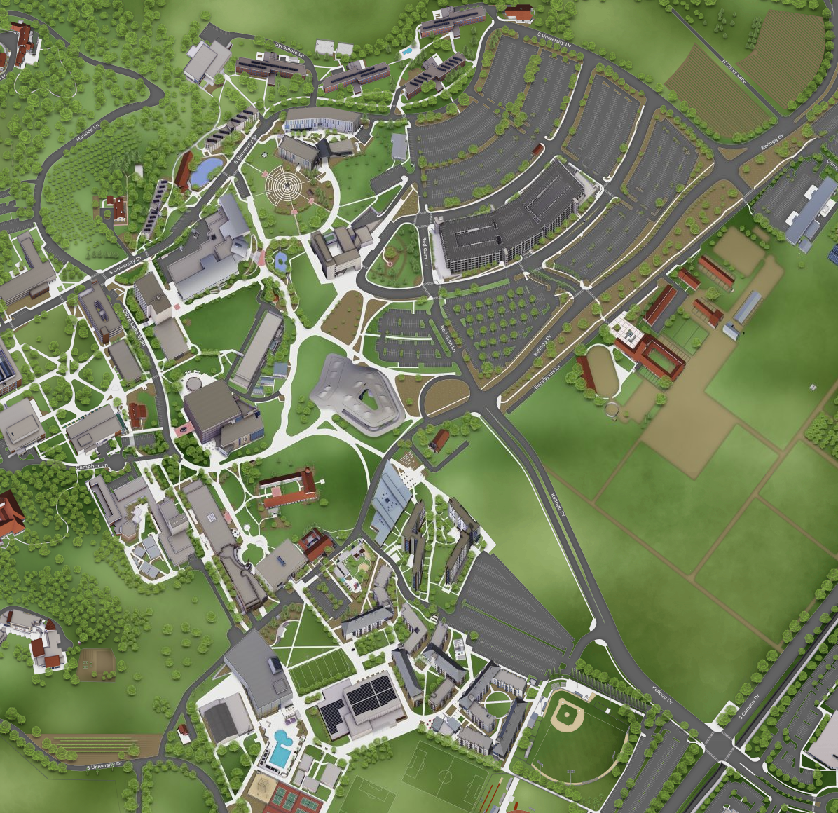
Utilizing some of the same materials from How to get to Cal Poly Pomona, a rough map showcasing landmark buildings on campus was created. This map was then placed on a tablecloth to be used at Cal Poly Pomona recruiting events.
