Horsehill Vineyards
Cal Poly Pomona - Horsehill Vineyards
Packaging Design \ Art Direction
Alongside one fellow designer, I helped lead development for the retail packaging design for Horsehill Vineyards to distinguish 11,000 bottles of Red Blend 2018 vintage from their existing catalog, represent Cal Poly Pomona's culture, and encourage sales
Horsehill Vineyards’ Red Blend 2018 vintage was anything but a normal project for the winery. Production was halted due to Covid creating a cascading effect of issues delaying its release. Foremost, a redesign was called for as the original label referenced an iconic campus building being deconstructed before the vintage's release. This then created the question:
How do you re-imagine something the client already liked? Research, innovation, and diligent communication.
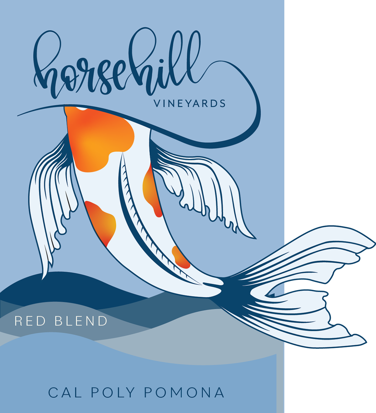
In completing this redesign, it was important to honor the original koi motif of the design alongside its general playful nature. Over 11,000 bottles were produced which are sold across Cal Poly Pomona’s campus.
Original Design
The problematic reference to a deconstructed campus building can be seen through the inclusion of geometric shapes. The triangular shape the fish is diving into, the triangular text frame, and the triangular forms in the background all nod to the historic 'CLA' building.
This building was previously the most recognizable piece of architecture on Cal Poly Pomona's campus. While these references were embraced when the design was created, time passed and the building was deconstructed. This ultimately lead the Horsehill Vineyards team to decide no references to this building should be made. With the original serving as an homage to this building, a redesign was necessary.
Initial Illustration Creation
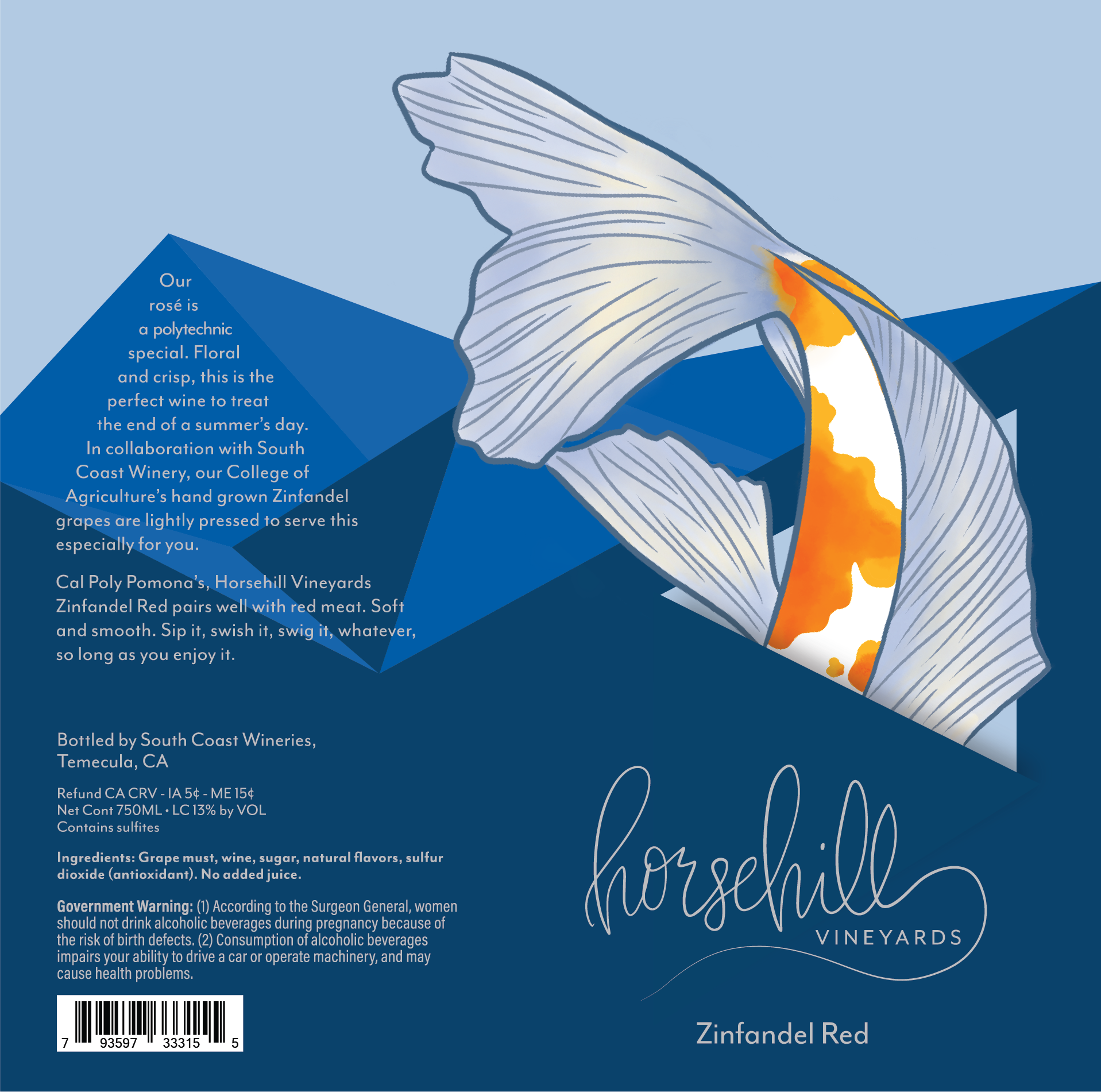
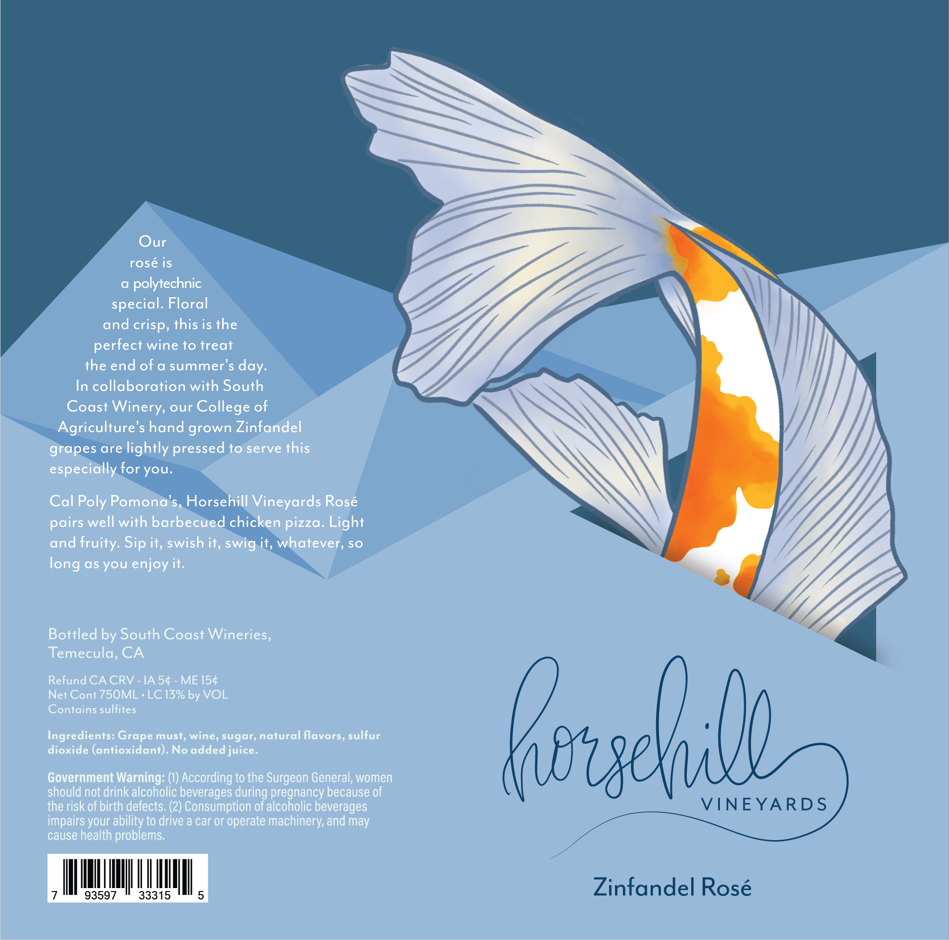
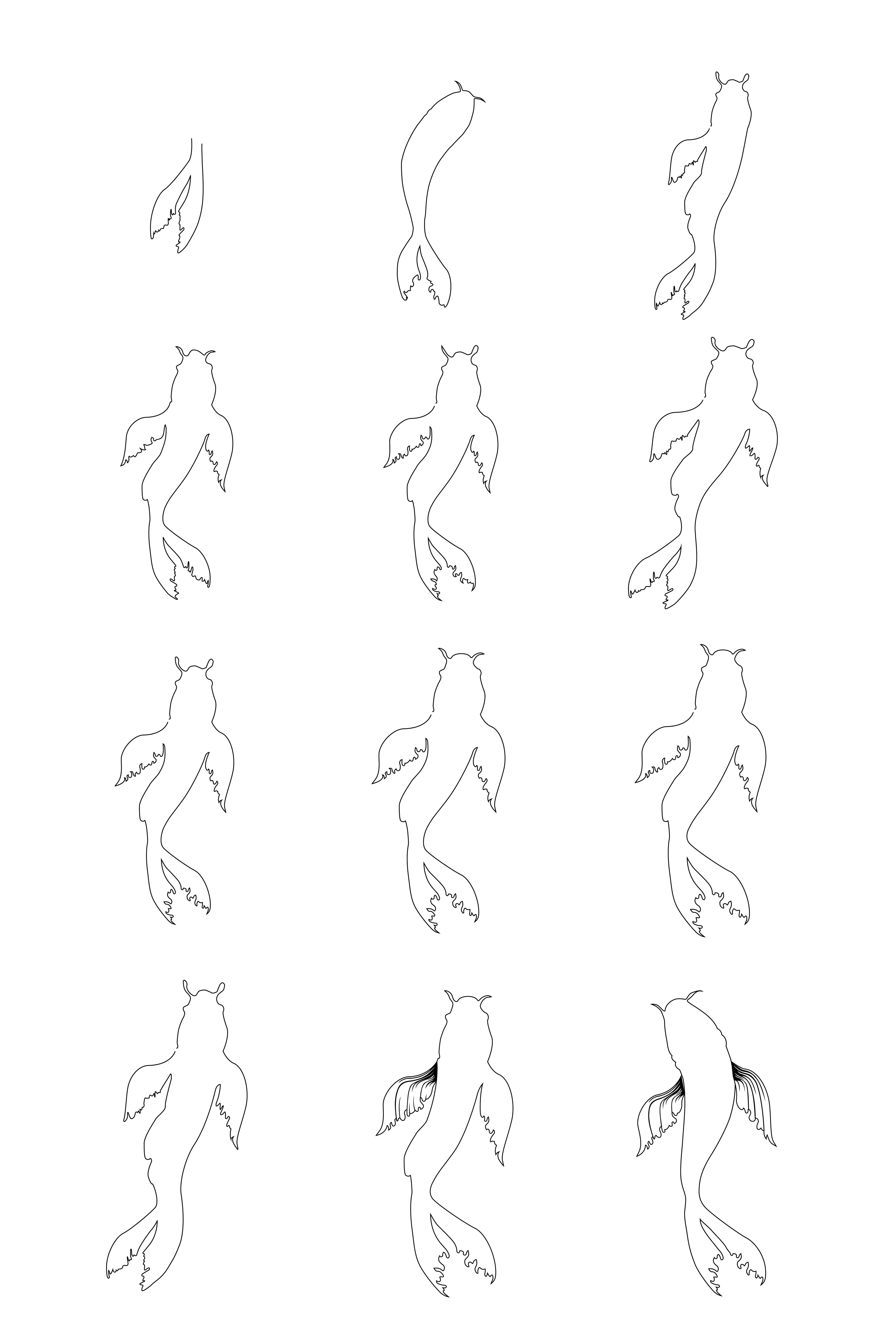
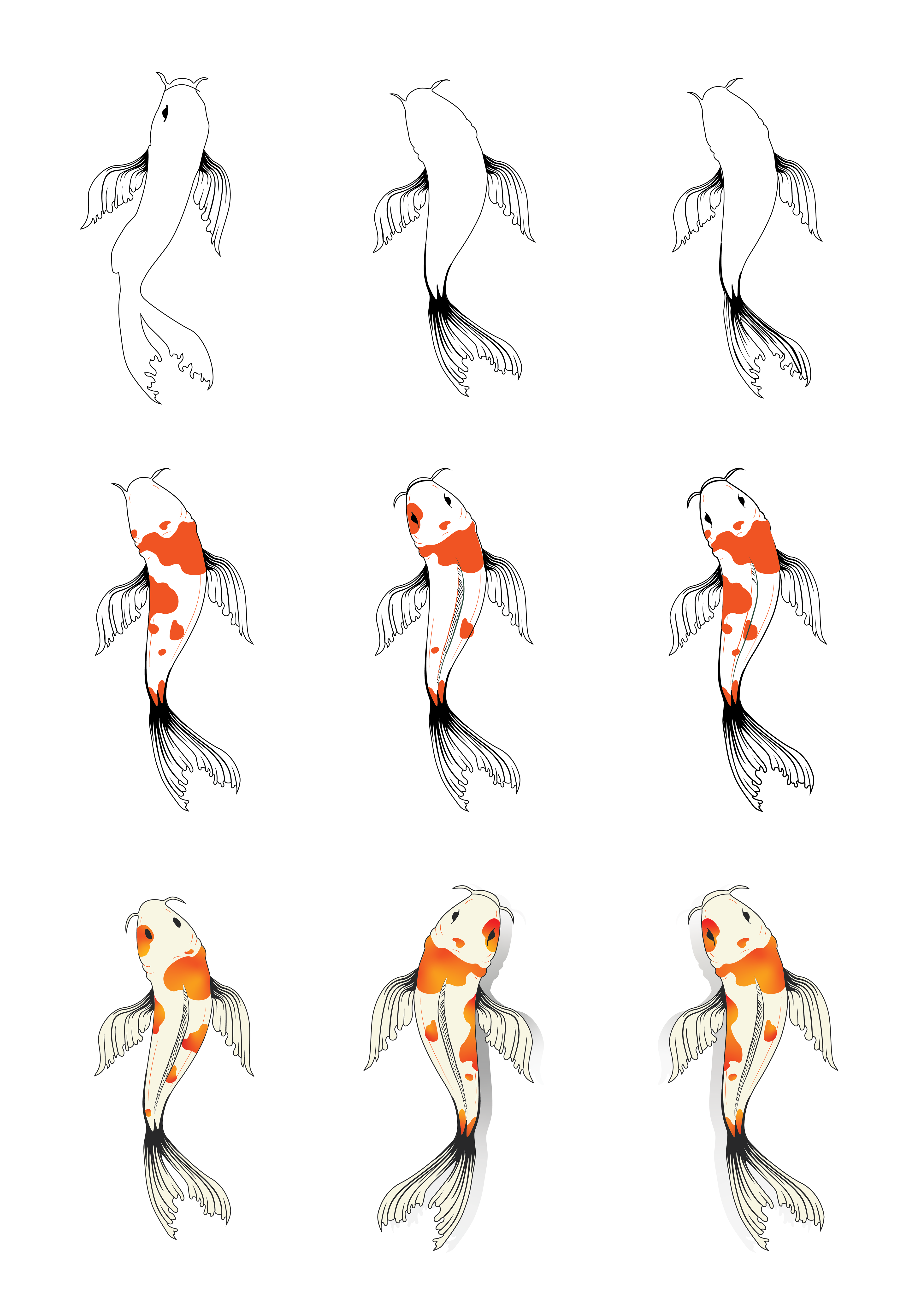
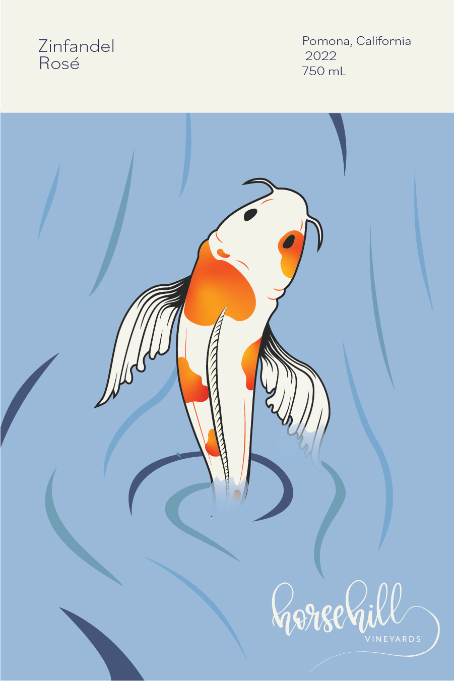
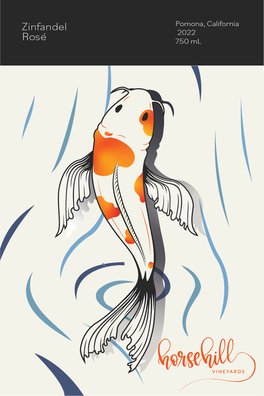
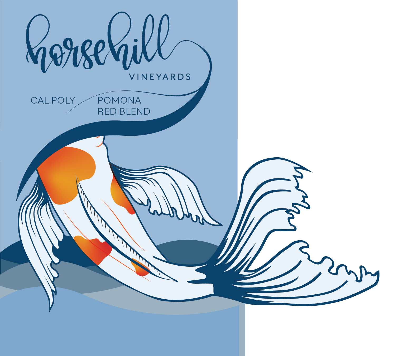
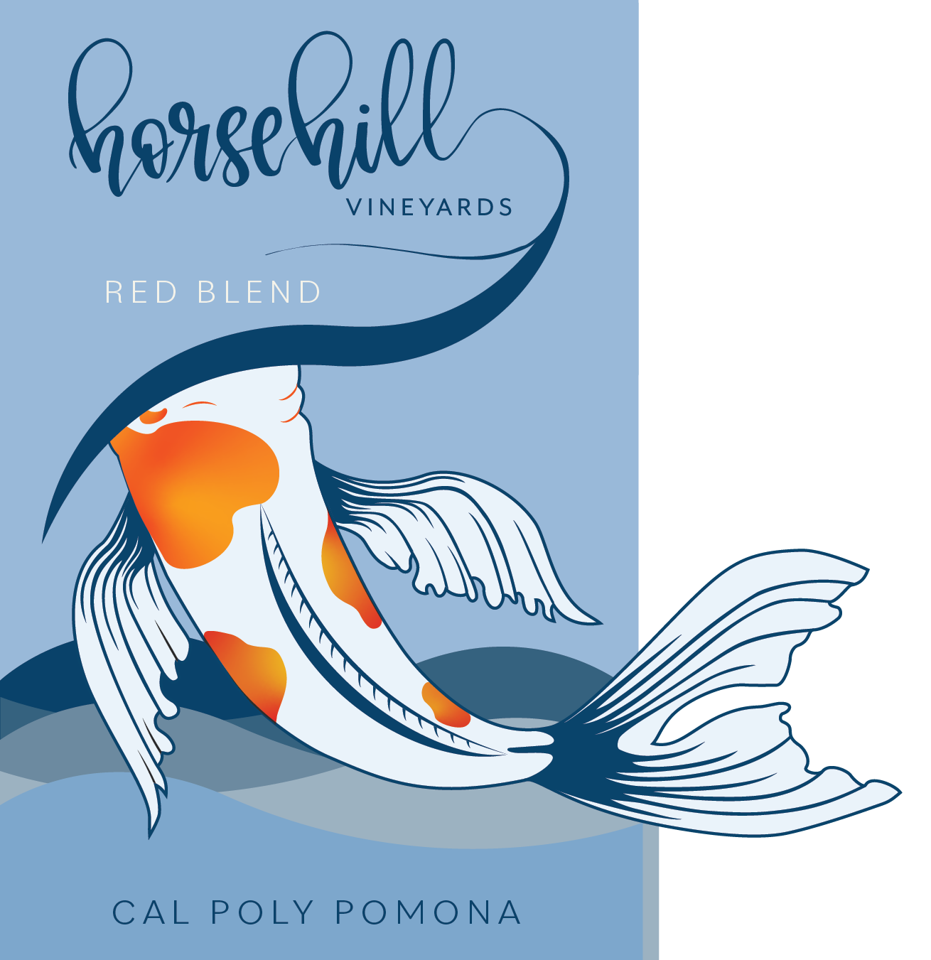
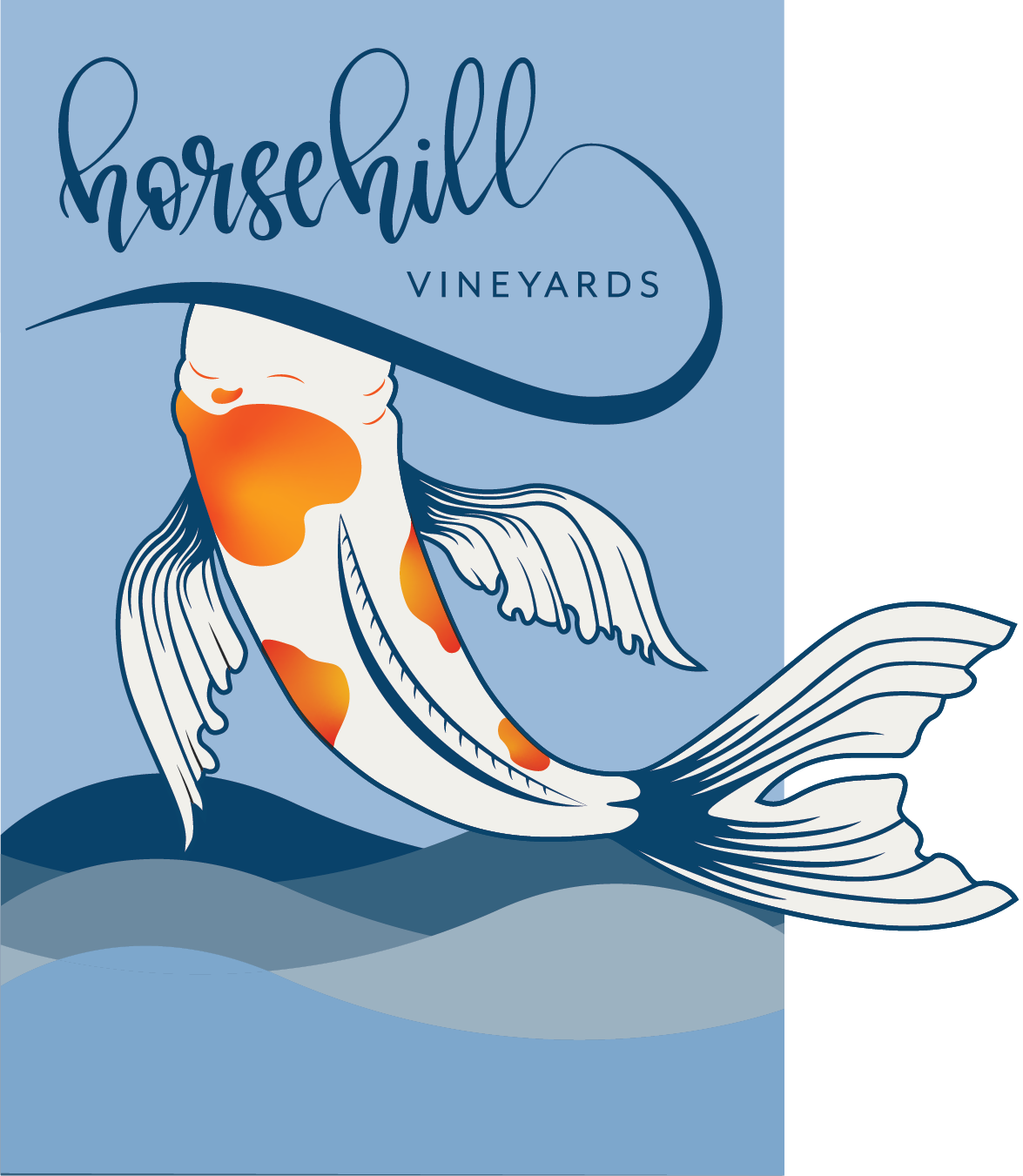
I took the responsibility of redesigning the koi illustration. A redesign was necessary for this section of the label for a couple key reasons. The updated romance text stated students are 'swimming upstream' to represent the challenges faced during the pandemic. In the original design, the koi is positioned diving downward, implying a downstream motion. Swapping the fish to upward orientation would better represent 'upstream' challenges.
Additionally, the original koi was slightly cartoonish in nature. Creating a more elegant and striking illustration felt more appropriate based on the client's opinion of what a red wine looks like.
Hand Lettering Development
While I was tackling the illustration, the remainder of the team updated the hand-lettering in the Horsehill logo with the intention of keeping the same playful nature of the original while providing greater contrast between thicks and thins.
In the original design, thicks and thins were near the same weight making readability a challenge at distance. Increasing contrast between thicks and thins allows for greater readability at distance, ultimately making the bottle easier to distinguish on shelves.
Front Label Development
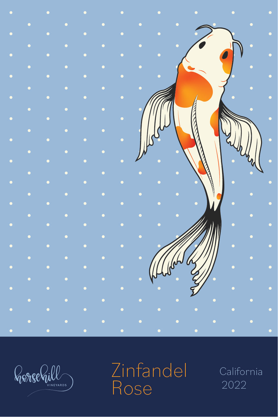
Reworking of the Horsehill logo was important for boosting readability on shelves. In the original design, thicks and thins were near the same weight making readability a challenge at distance. Increasing contrast between thicks and thins allows for greater readability at distance making the bottle more likely to be picked out and purchased.
Back Label Development
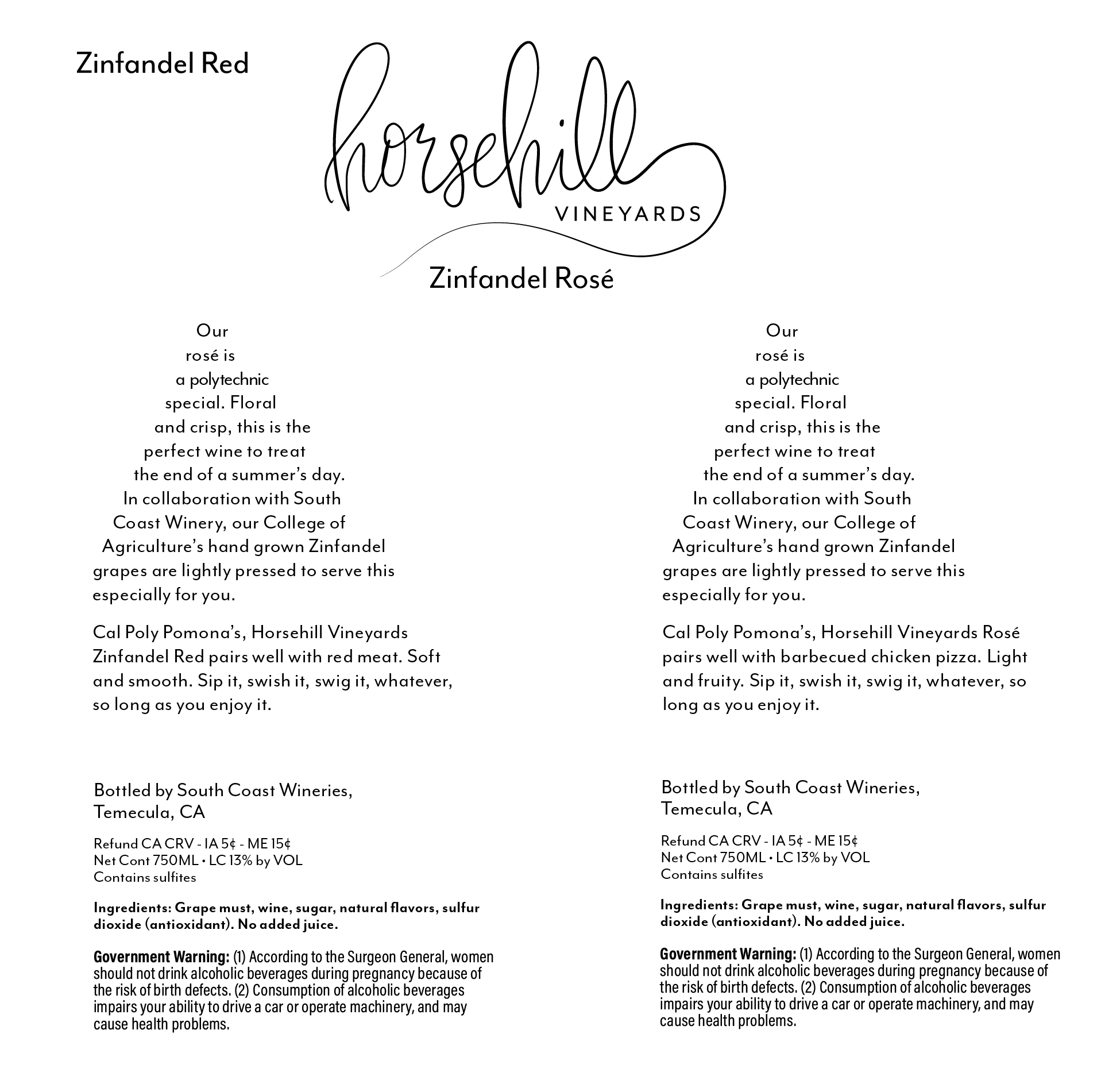
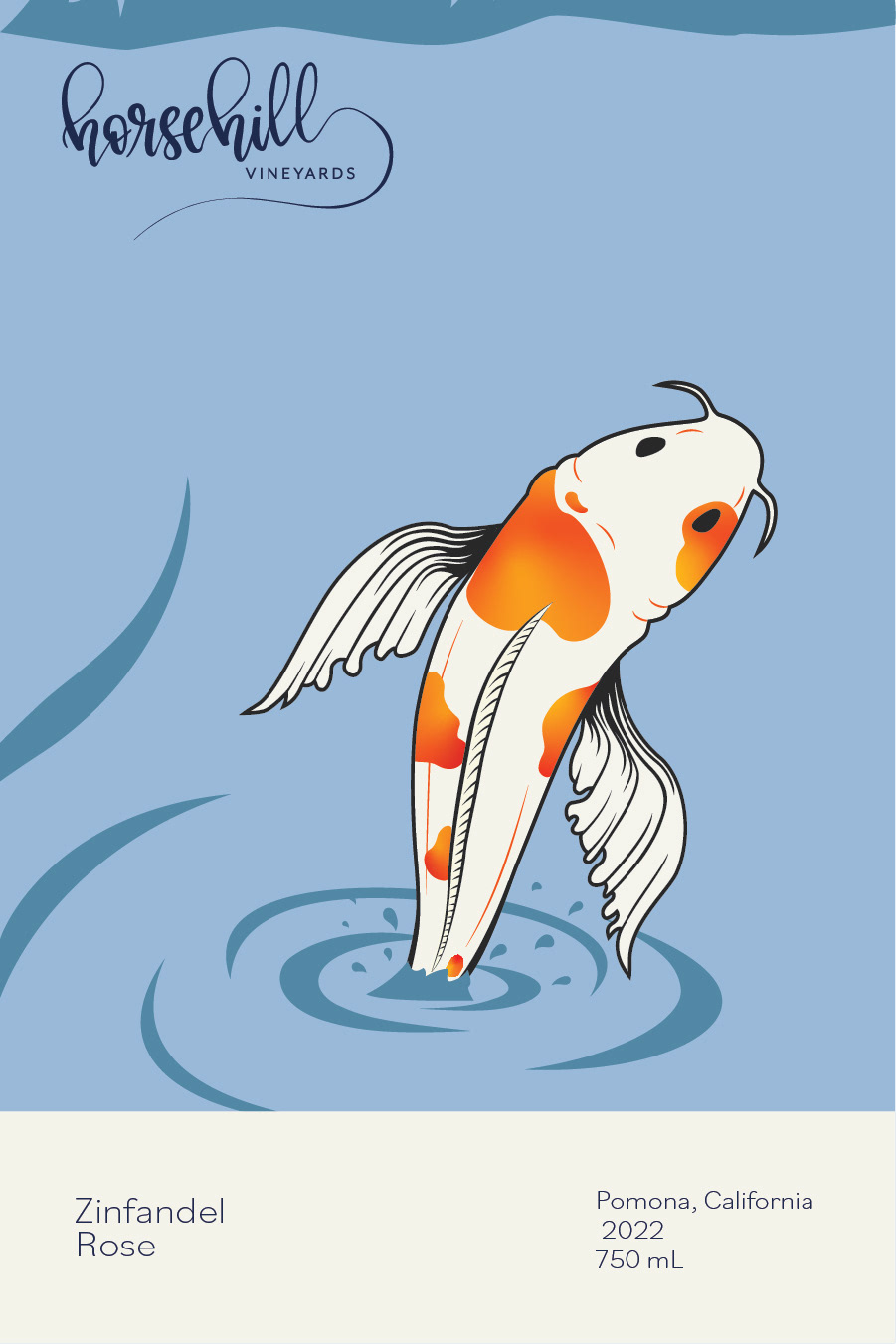
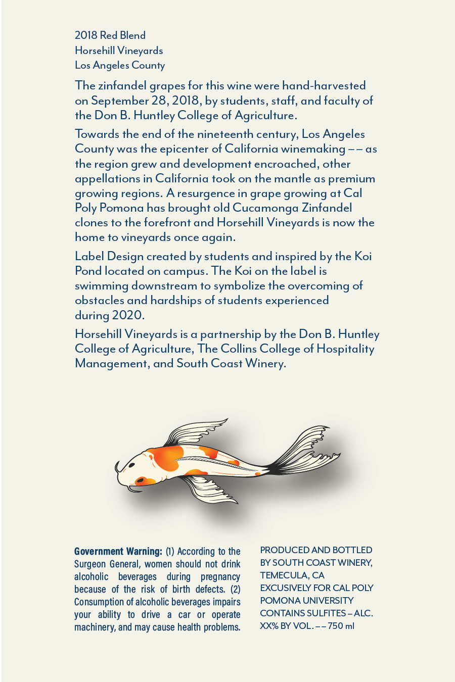
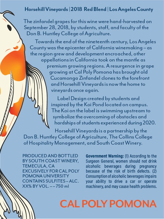
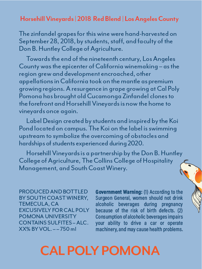
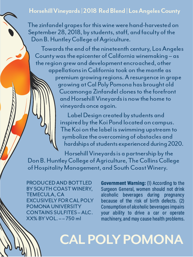
Back label development was completed simultaneously with front label development. These designs were a strong collaboration between Trinity and I. With both of us having limited experience in anything similar to a back label, we had to lean into each others individual skillsets and bounce ideas off of each other constantly.
Design Rejection
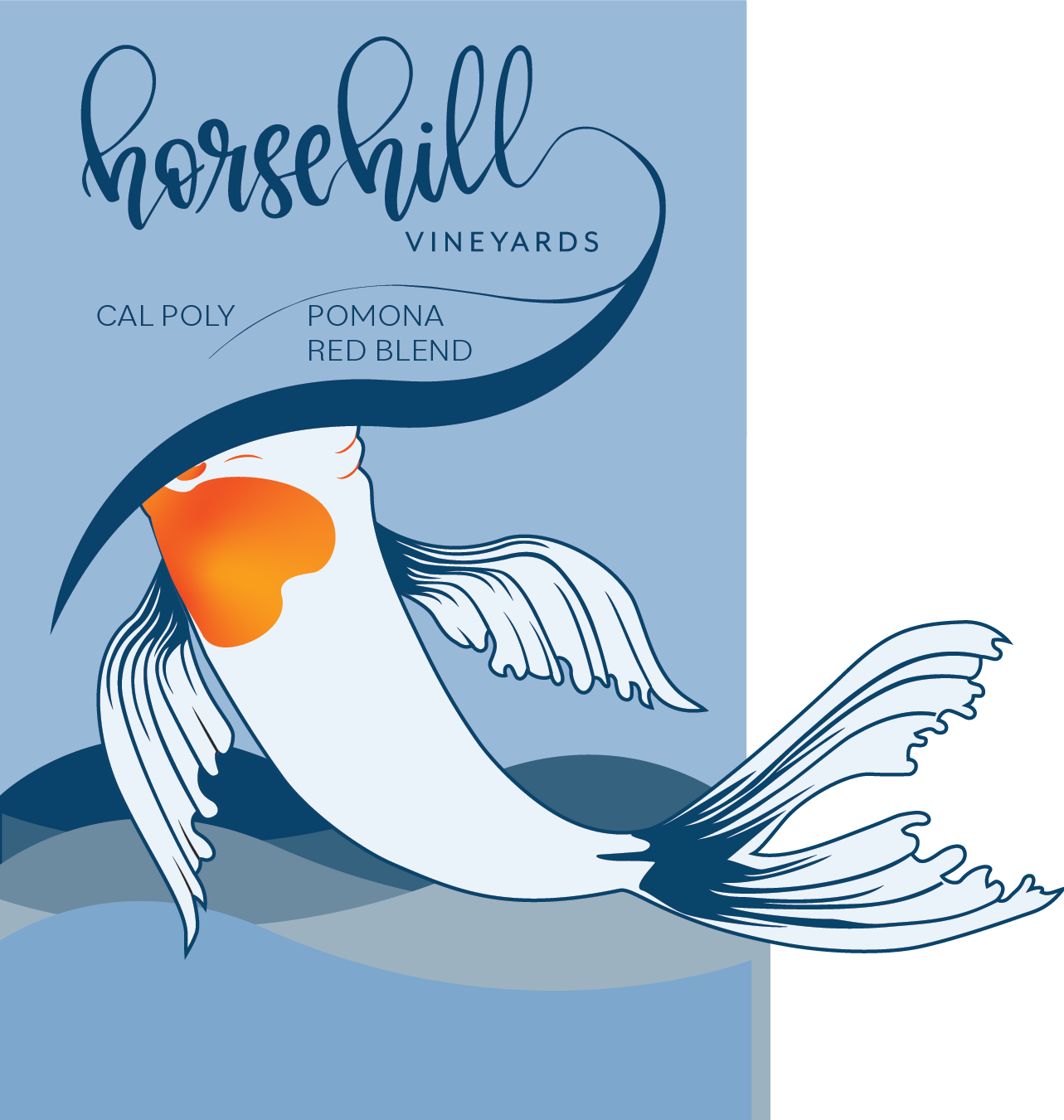
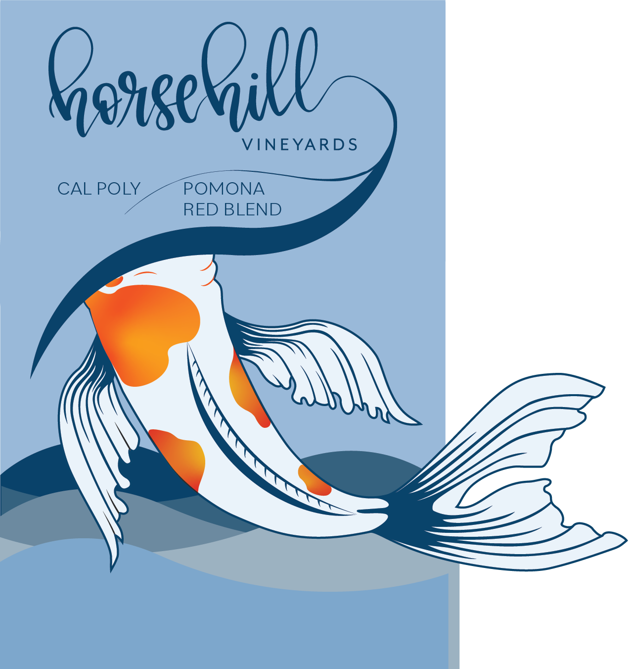
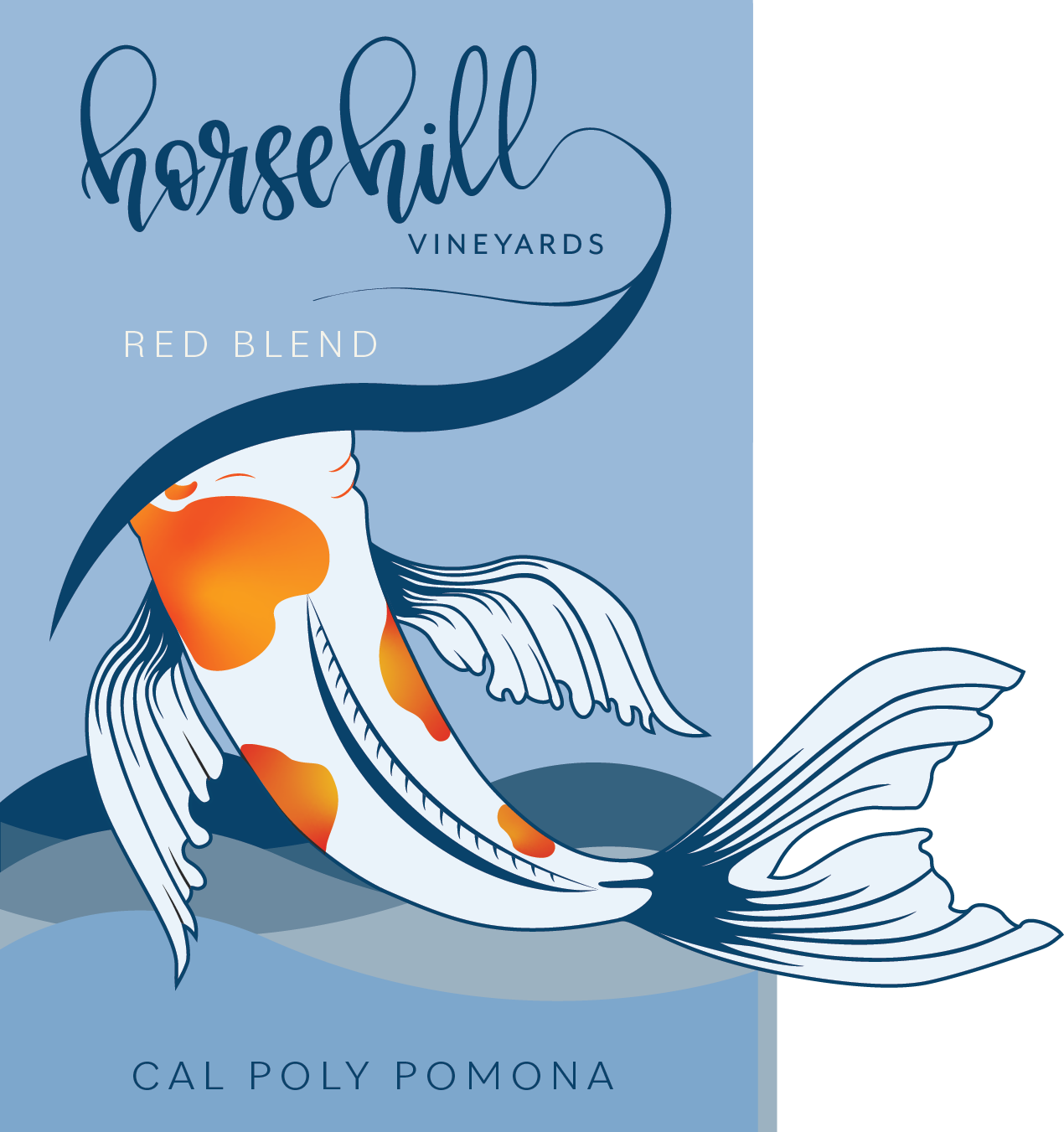
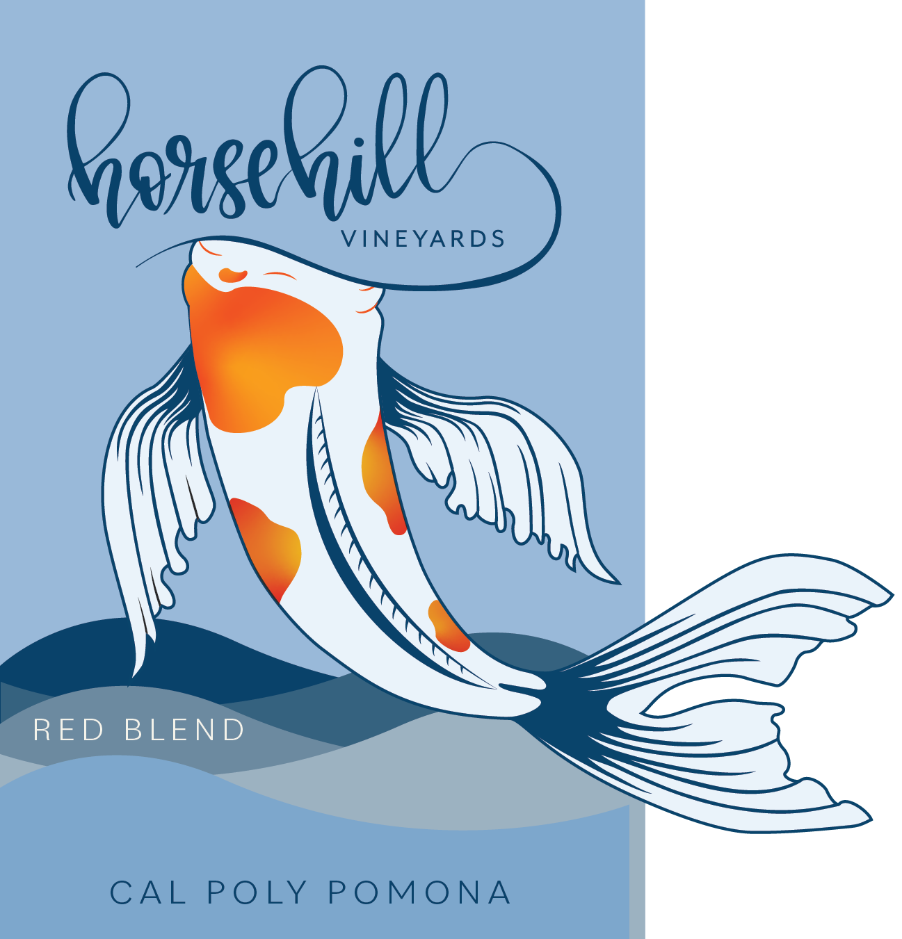
After the first official check-in meeting with clients, we found they didn’t like the direction the design was heading. We learned they preferred a blue background, didn’t want to see the head of the fish, along with other small technical changes. With my job experience and understanding of client interaction, I asked the right questions and was able to move forward to produce something the clients would like. The problem though, was the team had 24 hours to pitch a new concept. Despite the quick timeline, we found a solution that would change Horsehill Vineyards forever.
Proofing and Print Operations
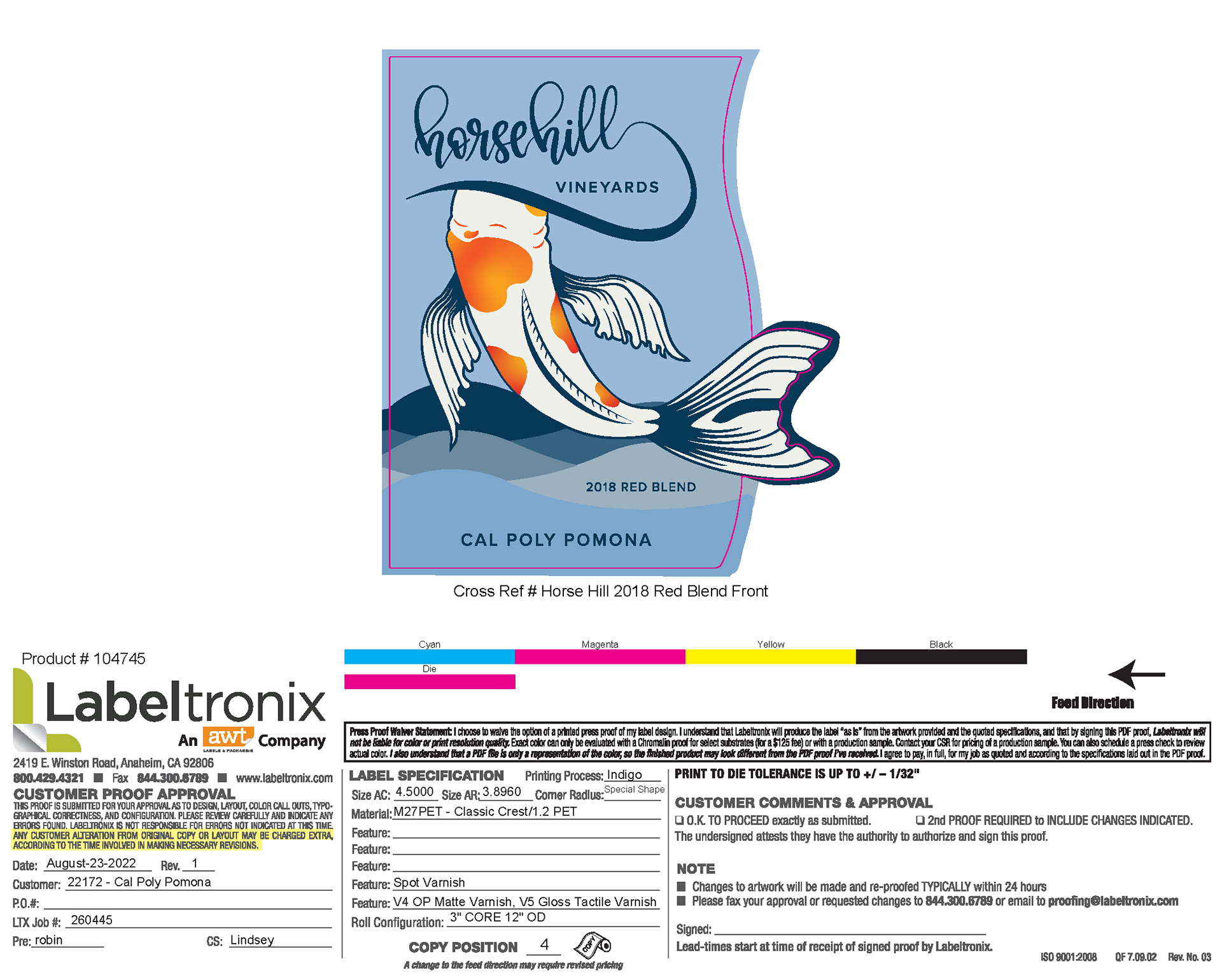
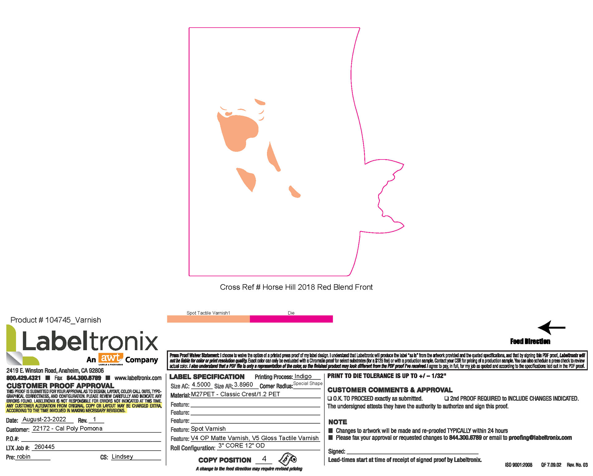
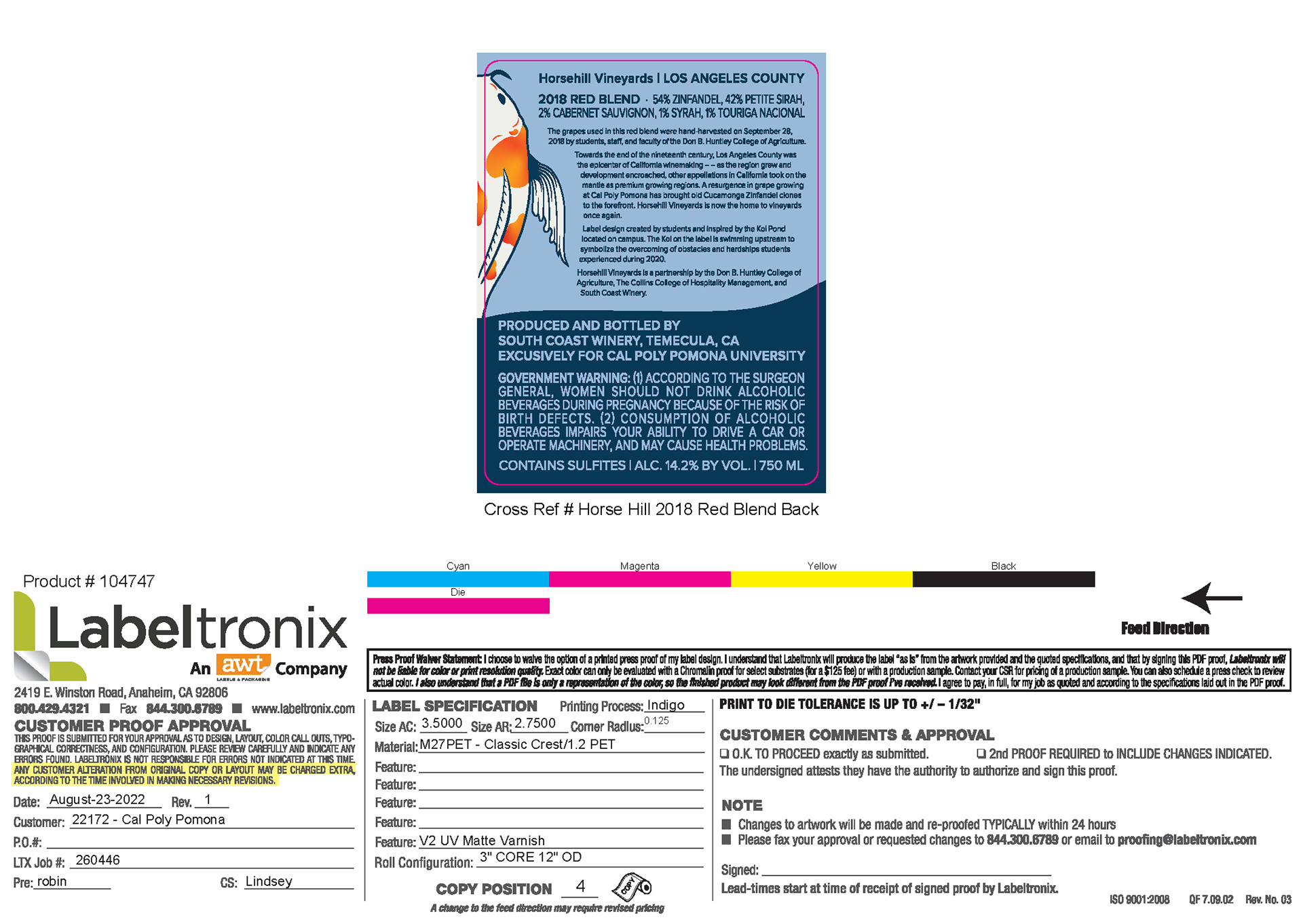
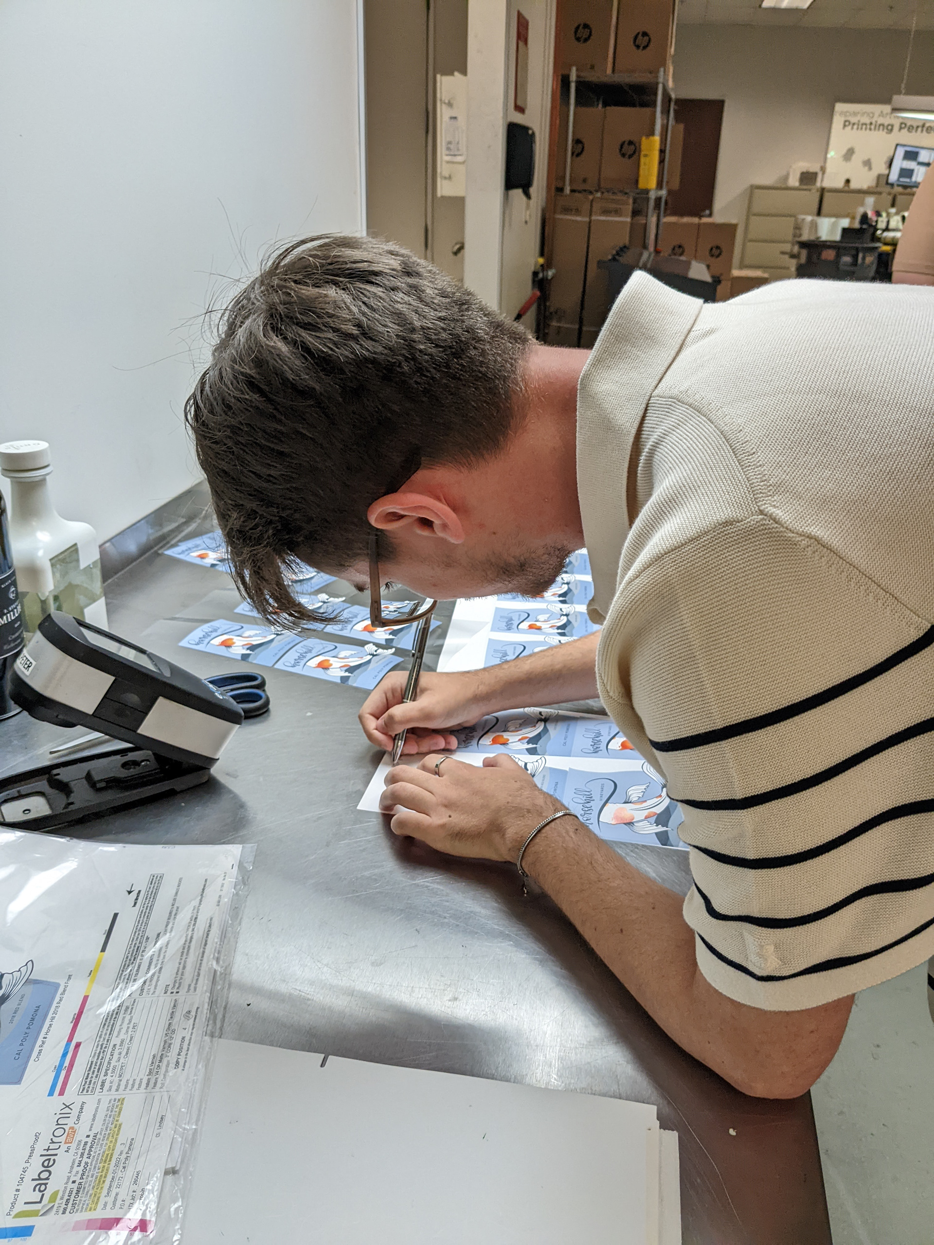
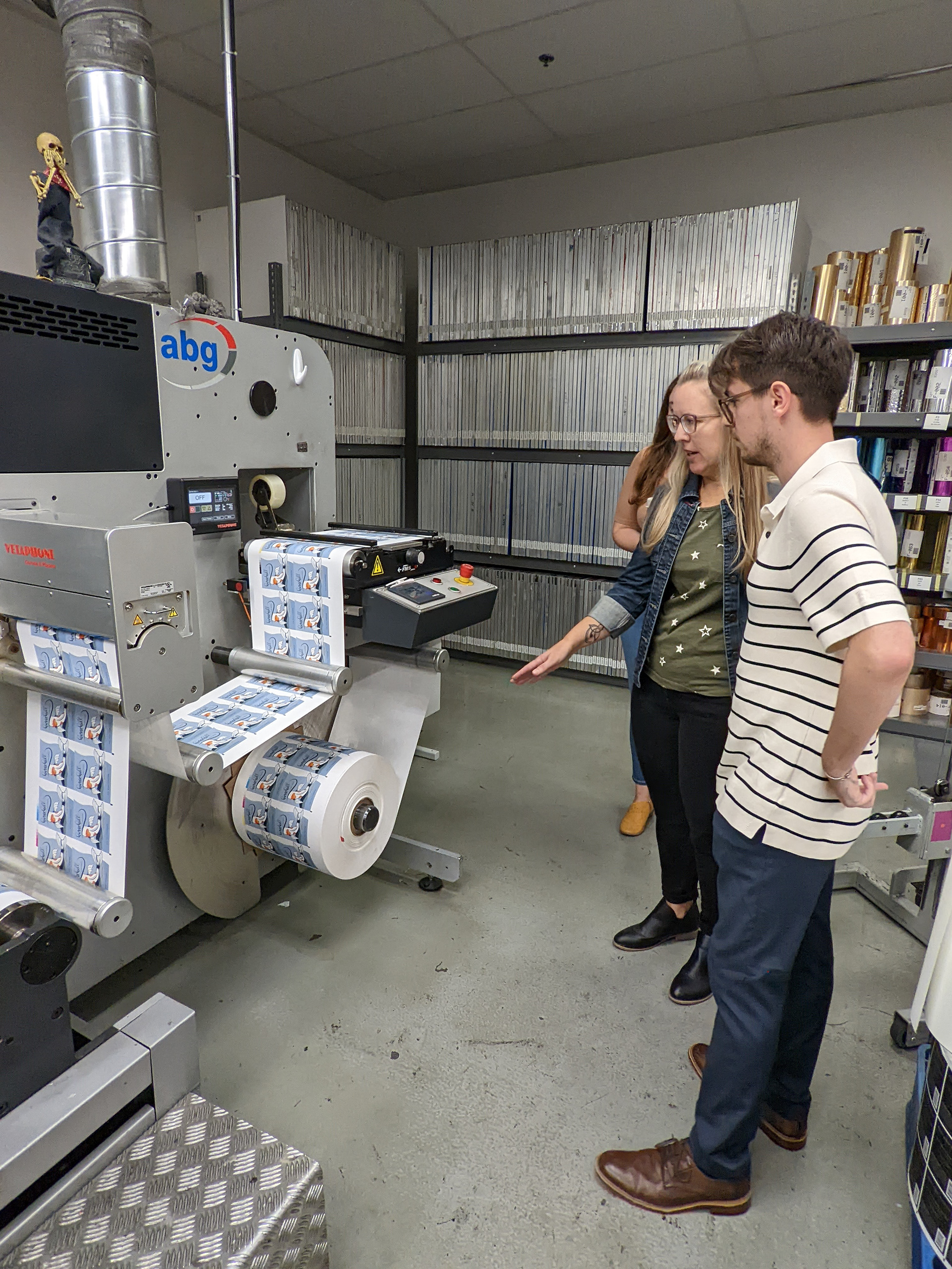
Before running the finished file on press, digital, color, and press proofs were reviewed by the design team. Key takeaways from proofs on this project were ensuring the die line for the fish tail was aligned correctly and catching various issues in trapping.
Finished Product

